Planning outfits for a family photo can be daunting but can really make a difference in your final images…so here are some quick tips to help you!
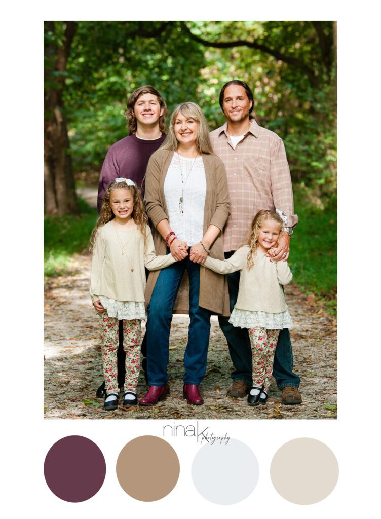
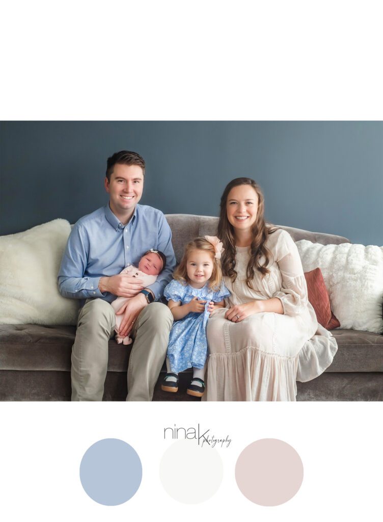
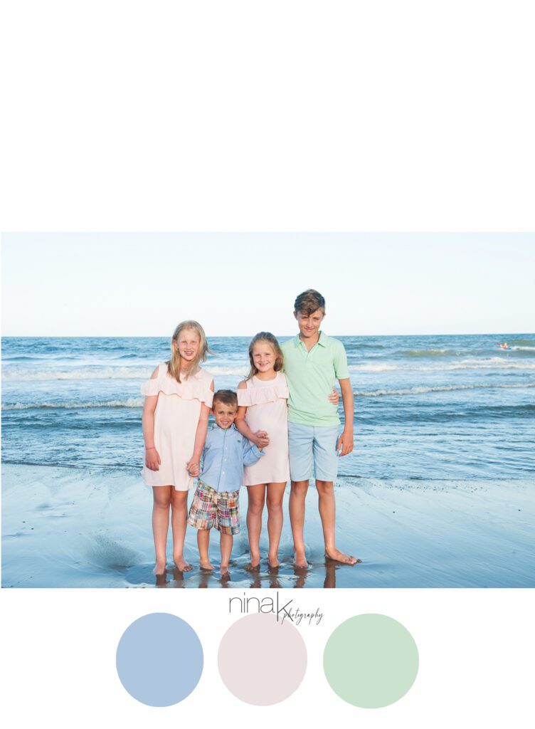
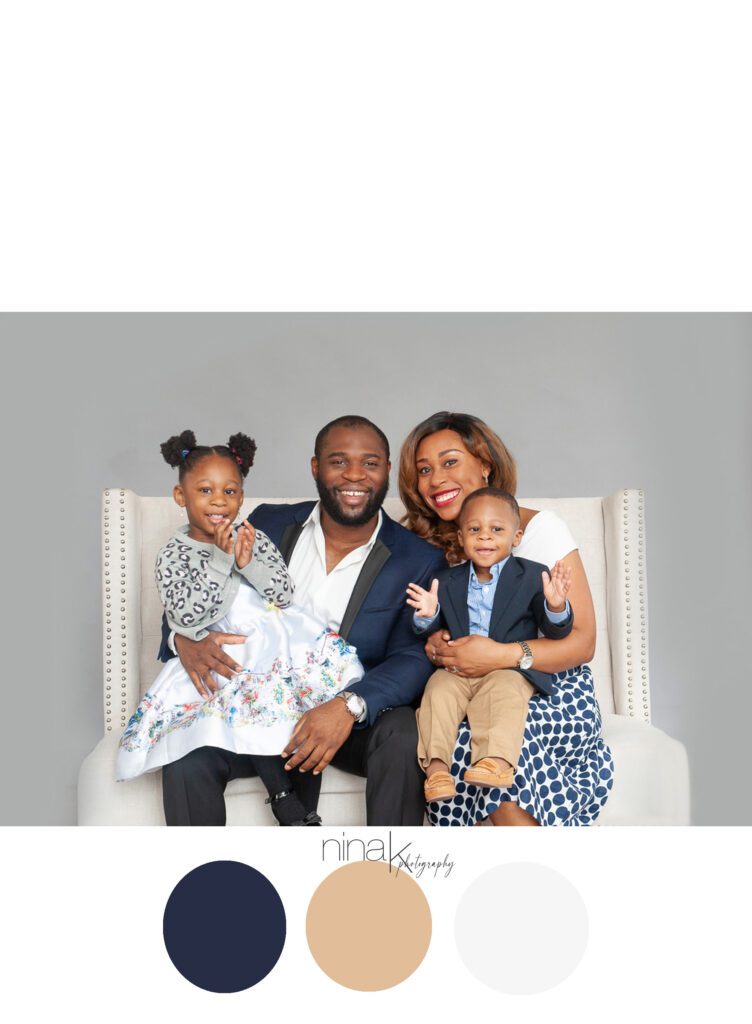
There are a couple factors that can help you decide on a color palette for family photos : Location and time of year.
Color schemes can really help to make an image look pleasing to the eye and give you a good starting point for planning outfits. Lighter shades work well for lighter backgrounds (ie: summertime, beaches, light studio backgrounds, etc) and deep colors look beautiful in most areas (fall time, parks, downtown areas, dark studio backgrounds, etc)
I always tell my clients that it helps to choose about 2-4 colors and stay within those shades. For example you can choose browns, blues and white. And then stay in the same shades of those colors. So you may have a dark brown and a light brown. Or a deep red and a light rose.
Try to choose colors that compliment each other.
Textures and layers can add dimension and detail to your photos.
Accessories are good, too!
Stay away from all white. It tends to wash the skin tones out.
Limit the amount of busy patterns you include.
You can always add neutrals (whites, beige, tans, grays) as they are “safe” colors and photograph nicely.
But remember there are no set rules! What is most important is to wear what makes you feel confident and happy!
Hey, if you want a crazy, fun picture, let’s do it!
Remember I am always here to help you!
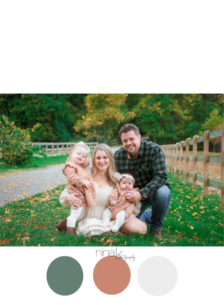
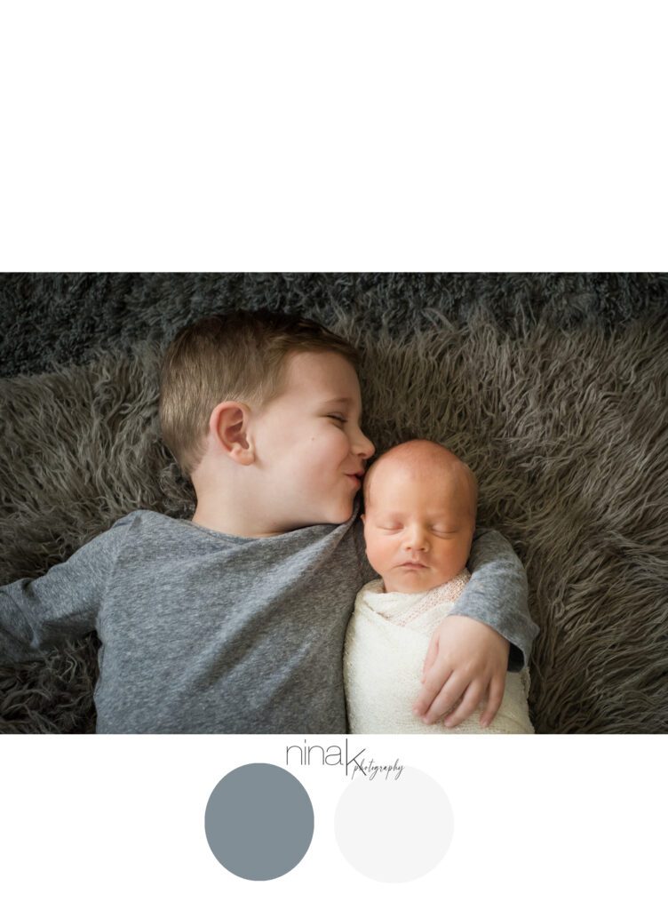
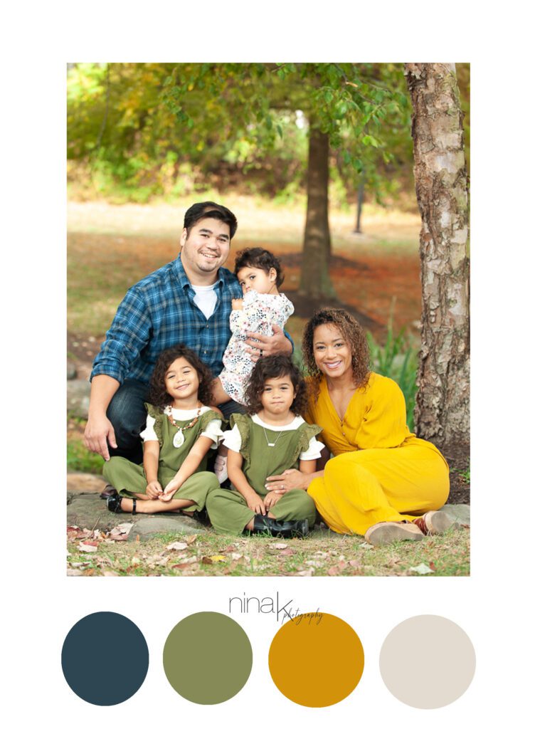
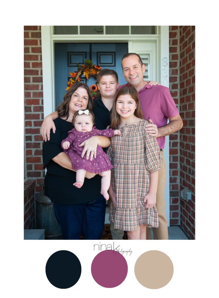
Here is some inspiration to get you started…


